The two images above are two variations of logos for The Finks LLC. As a woodworking business located in Kansas City, Kansas, they wanted a geometric logo to relate to the way the make their items. The right side was intended to show their most popular item, hexagon shelves. The left side was created with the idea to make the word "Finks" look like it a forest with the long thick lines.
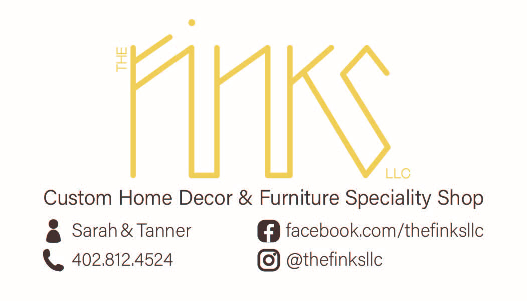
The above photo is the front of the business card for The Finks LLC. The back of the business card is a picture of wood. The logo itself was printed in gold foil to show the finer aspect of their products. They wanted one business card with both of their names on it so it was easier for all their calls to go the one phone.
The two photos above are Mr. Remodel LLC 's redone business cards. Drew had his business cards made when he first started out his business 4 years ago by a close friend. He decided a year and a half ago that he wanted his business cards to have a more professional feel.
